Color and Finish Design
Colors, finishes, patters designed for products // packaging // merchandising
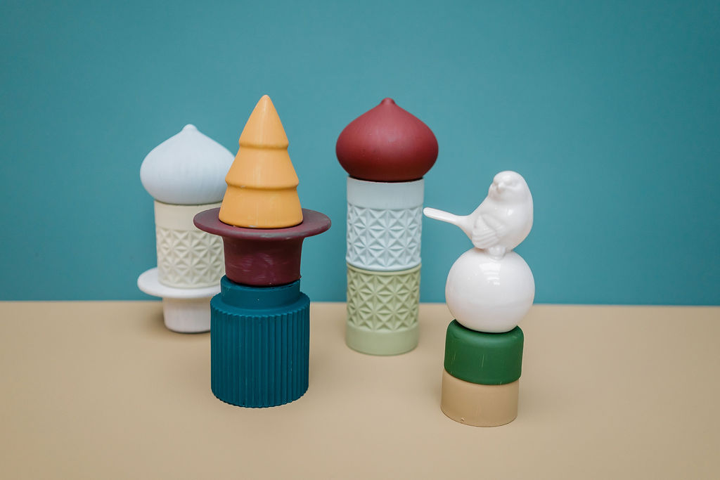
As color consultants, we conceive of shape and color as interdependent, not hierarchical, but with a reciprocal give-and-take. Shape does not take precedence over color and nor does color take precedence over shape. It’s a question of the creative approach to the project. This interdependence is a little like good chemistry that creates what we call style or a trend, standard or convention. It all depends on the project specifications. Good color design makes it impossible to separate shape from color as they fuse into perfect, expressive harmony. Color creates meaning and evokes emotion.
Example: Color and Finish Design for LUDOPARC
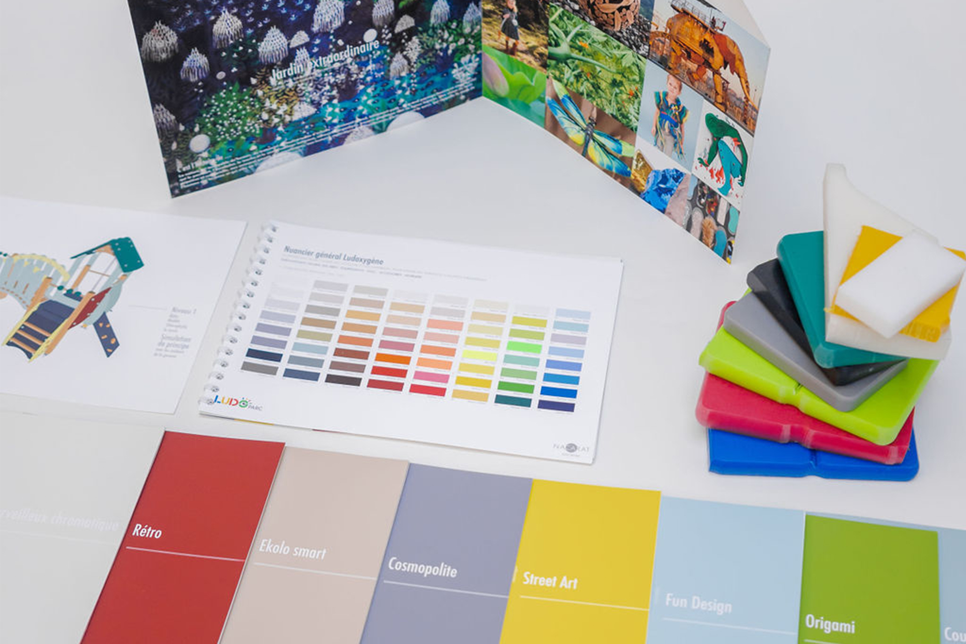
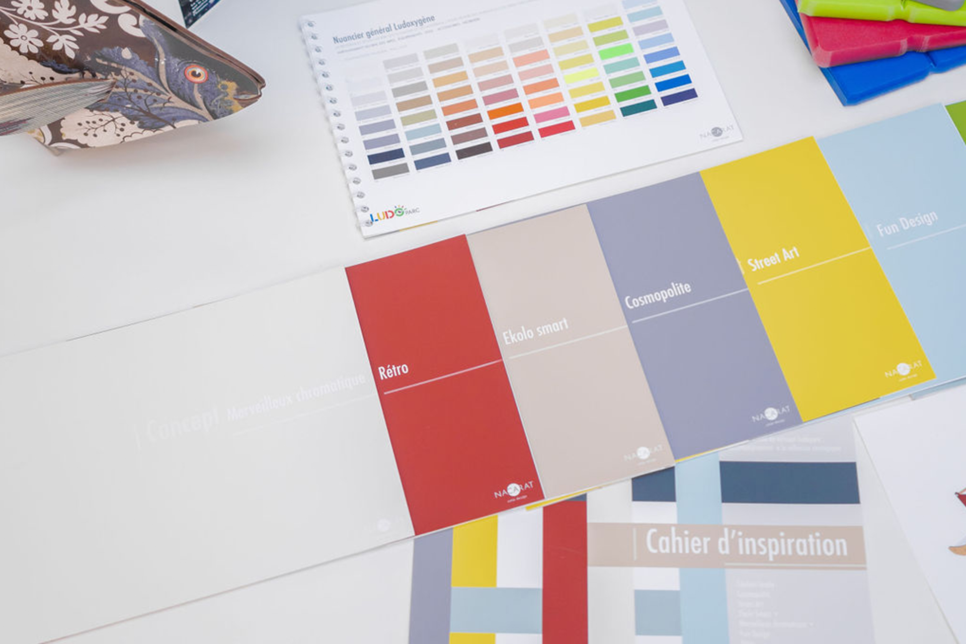
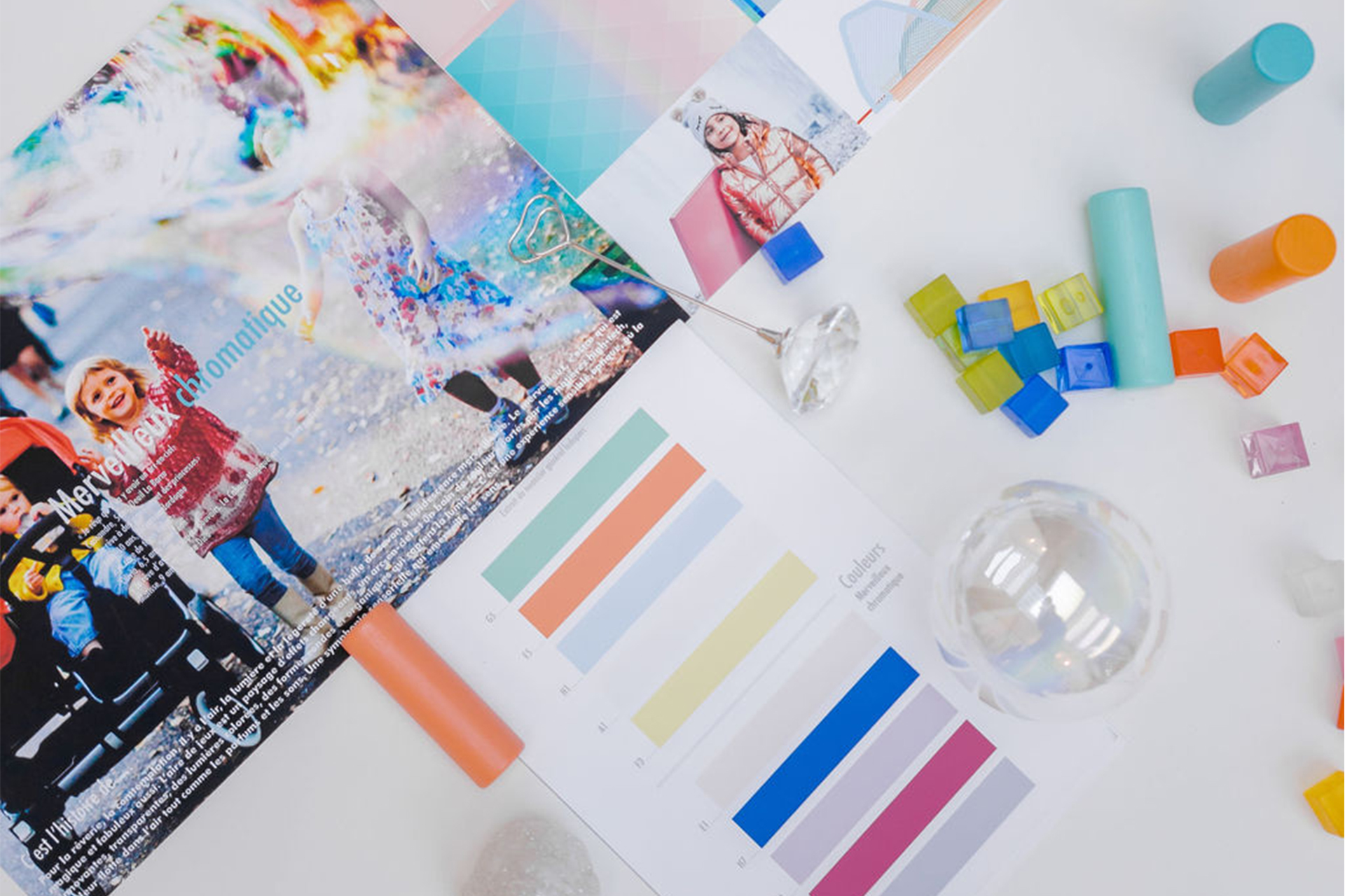
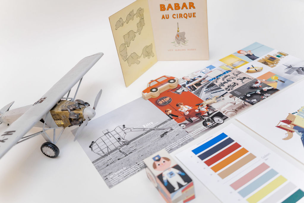
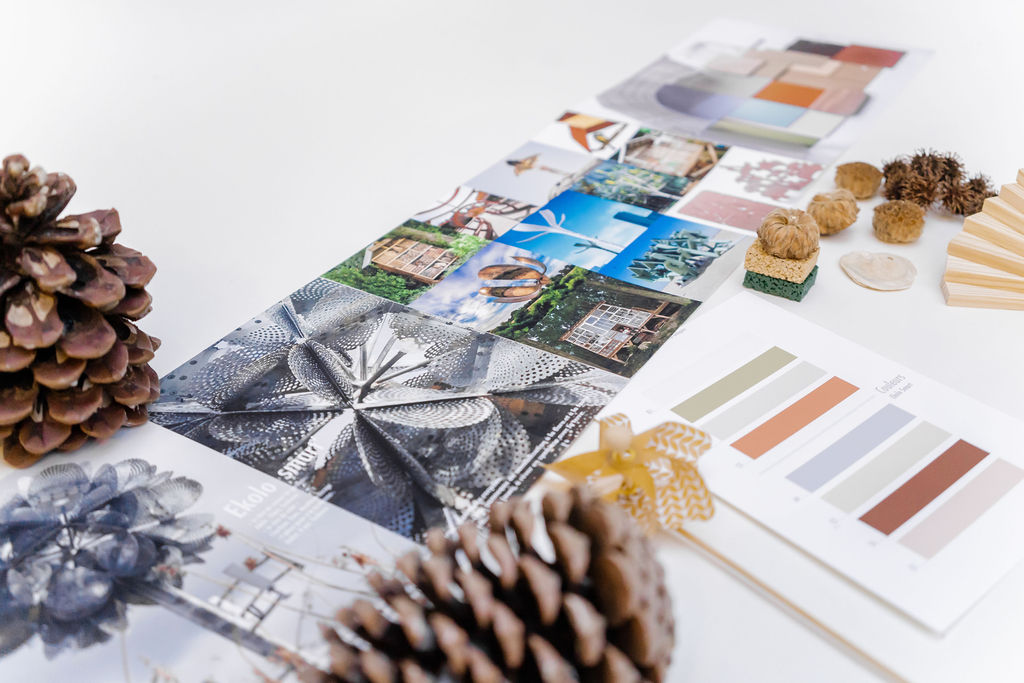
Ludoparc is a French company that has specialized in designing and developing recreational spaces for more than 30 years. It is a reputed partner for playgrounds and athletic and fitness spaces. Ludoparc hired us to create an inspiration book and the color design for its various playground concepts that invite children to escape.
- On-site study of playgrounds in France
- Design of an inspiration book for around a dozen concepts
- Creation of a color charter system for seamless design that stands out depending on the chosen universe
