Visual Identity
Logotype // Graphic and color charter
Which color? … Red, orange, yellow, green, blue, purple, pink, grey, white or black…?
Each color has its own emotional, sociological and historical connotations. But we must imagine the intricacies and complexity contained in these three aspects. We decide which color to use based on color uses and practices, knowledge that we continually cultivate, generating and regenerating symbolism and emotional connotations. This is the case for the color green. And there is not one green, but many, as it englobes a multitude of interpretations that develop a very rich palette of nuances that speak to us of ecology, biology, humanity, modernity, medicine, etc. All of these aspects are important, essentially positive values that have been adopted by today’s society. Emotion is tightly woven into our conception of beauty. It’s a phenomenon, with a psychological aspect, as well. Beautiful colors that captivate us are difficult to identify because they relate to a very personal esthetic experience. Emotion is not necessarily linked to sociological and historical values. And that’s good news! Thinking outside the box is also a great idea.

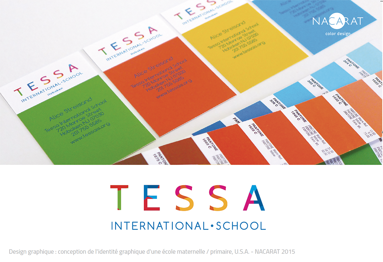
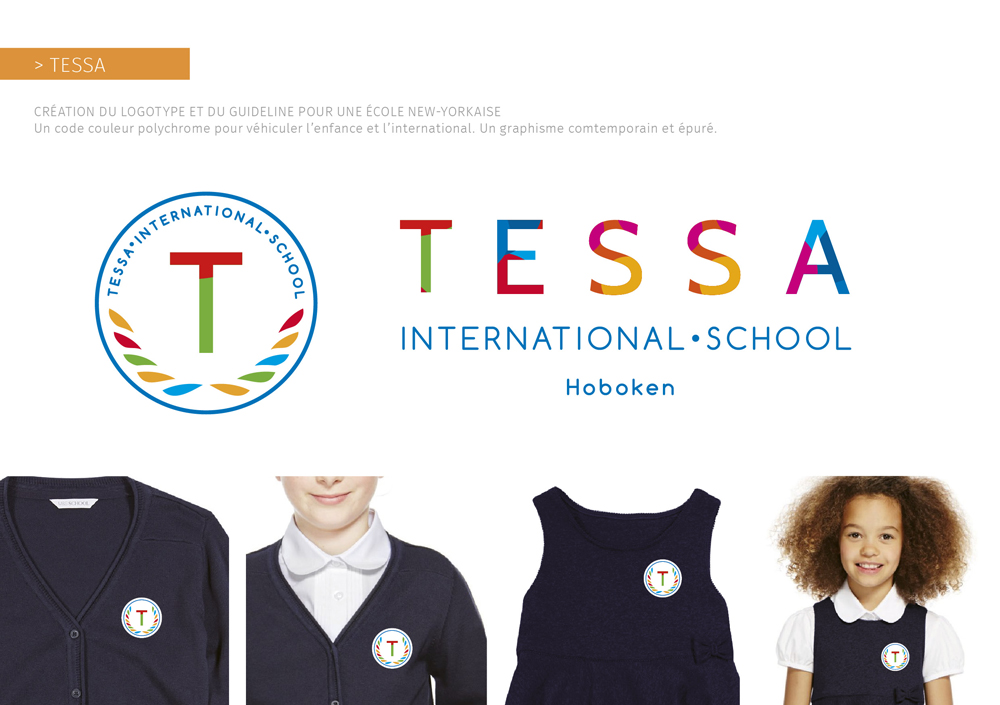
Creation of the visual identity of TESSA, an innovative international school in New York
Tessa International School has a trilingual French, Spanish and Mandarin program. With students from 32 different nationalities, it prepares the citizens of tomorrow for a new world based on mutual respect. TESSA hired us to create their visual identity when the school was founded. We designed the logotype and graphic charter that communicate these values.
- Study of the brand’s needs, goals and values
- Study of competitors’ visual identity
- Creation of 6 graphic guidelines for logotypes
- Creation of the graphic and color charter
- Creation of communication tools for the launch

